|
Nov
15
2023
|
|
Posted 2 years 243 days ago ago by Admin
|
|
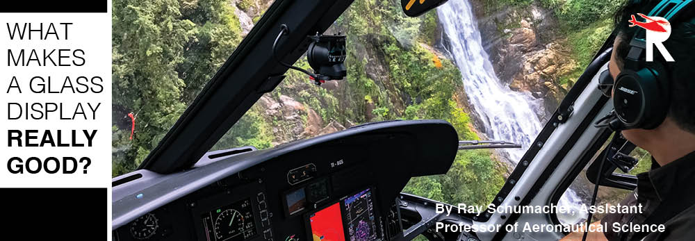
Most pilots these days have logged some time in an aircraft with a Garmin G500H coupled to some type of drive unit, such as a Garmin 430, 650, or 750. The primary flight display (PFD) and multi-function display (MFD) provide you with almost all the information a pilot could need to efficiently aviate, navigate, and communicate. While you probably noticed the design elements you loved and made your life easier, if you are like most helicopter pilots however (i.e. a touch of a cynic), you’ve also noted some design features you thought Garmin should have done differently. An enormous amount of time, money, and research has been spent creating the features that make a great display- or likewise condemn an unsuccessful one noted only for its commercial failure. We are going to focus this discussion on the way the human brain interprets the information a PFD gives the flight crew, as this is a large factor in commercial success. We’ll use the Garmin G500/G500H models as representative displays.
What makes a great PFD? A PFD must provide information in a manner that is consistent with human cognition and psychology so the flight crew can accurately perceive and understand the factors and conditions that affect safety before, during, and after a flight within these five fundamental ‘P’ elements: Pilot, Plane, Plan, Programming and Passenger (FAA, 2016). In other words, a PFD must allow the flight crew to gain and maintain situational awareness quickly and effectively. To do this, the human brain requires accurate, complete (or mostly complete), flight information. The pilot perceives and processes the sensory stimuli, applies the cognitive process, fills in the gaps, and infers future events.
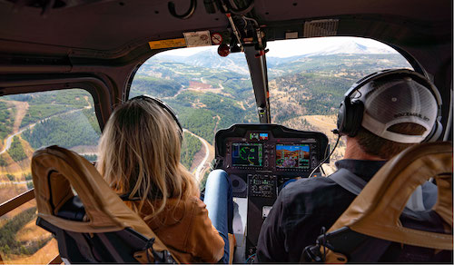
We all remember the early, stressful days of instrument flight training. To varying extents, we struggled to use the flight instruments to create a three-dimensional mental picture of the helicopter’s position in space and then use pitch, roll, yaw, and power to navigate from departure to destination using electronic navigation, all while completing radio calls and checklists. Over time and with lots of practice, we mastered the skills of instrument cross-check, interpretation, and aircraft control— at least well enough to pass a checkride. We learned to quickly and accurately read instrument information like altitude, heading, and course, and then make timely control inputs to ensure the helicopter was performing in the required and expected manner. Those who have flown both a traditional “six pack” with analog instruments, then a glass cockpit, then transitioned from one to the other, have experienced the additional difficulty of scanning and interpreting different instrument displays.
A well-designed PFD combines layout, size, and colors or highlighting to transmit information to the pilot in a manner that is easily perceived and interpreted. Layout includes where the instruments are located, the space occupied or size of each instrument, and the information density. Information density is the amount of information per pixel of the display area. Garmin chose to make the attitude indicator occupy almost the entire PFD with a brown color representing the ground and a blue color representing the sky. By contrast, an analog attitude indicator is much smaller but uses a similar color scheme. In the G500, the altimeter and vertical speed indicator are on the right side of the PFD, the airspeed indicator is on the left side, and both the heading indicator and rate-of-turn indicator are on the bottom. The inclinometer (slip/skid indicator) is incorporated with the bank index on the attitude indicator (fig. 1). This arrangement is similar to a traditional six-pack configuration with the primary exception being the location of the turn coordinator and the fact the turn coordinator is divided into two pieces instead of being displayed as a single integrated instrument. Another difference is that the G500 displays airspeed, altitude, and vertical speed as vertical “tapes” as opposed to traditional dials.
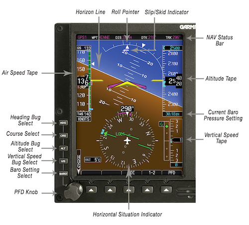
However, when we look at the size of each instrument, things begin to differ even more. In a traditional cockpit, each circular instrument is roughly the same size. The general trend in modern PFDs is to increase the size of the attitude indicator (Garmin, 2016). In the Garmin PFD, the attitude indicator occupies almost the entirety of the PFD and sometimes acts as the “active background” of the entire display. The heading indicator is given greater prominence as the second-largest instrument, while the airspeed indicator and altimeter are roughly the same size. The vertical speed indicator is the smallest of the primary flight instruments.
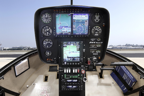
Information density is something that merits discussion, but can be a point of high variability, controlled by the size of the display and the amount actively displayed for that size. If you have flown with both a G500 display and a G1000 display, then you have noticed the difference between larger and smaller displays. Some Garmin displays add synthetic vision (fig. 2) and miniature maps, both of which increase information density. Additional information such as true airspeed, ground speed, outside air temperature, wind direction, and GPS information further increase information density. Helicopters with autopilots include even more information. As you would expect, a significant correlation exists between the amount of screen clutter, missed alerts, and response time to alerts, especially during high workload situations (Moacdieh et. al, 2013). However, increasing information density by adding synthetic vision has been shown to make a positive impact on situational awareness (Ellis et. al, 2021). PFDs have the potential to display a lot of information in a relatively small area in a way previously thought impossible.
The last major cognitive clues, color and highlighting, help emphasize information. The FAA provides guidance to standardize FPD colors in both regulations and advisory circulars. Several experiments have utilized eye-tracking software to track a pilot’s fixation on a particular part of the PFD. The number of times a pilot looked at a given area of the PFD, and the time a pilot spent looking at that area, was primarily influenced by the presence, or lack thereof, of distinct colored boxes surrounding information such as airspeed or heading that were being controlled by the autopilot. “Response time on cognitive processes was also shortened, as shown by the significant reduction in fixation duration on augmented PFDs in comparison to traditional PFDs.” (Li et. al, 2020). The change in how often a pilot looked at different sections of the PFD can be seen in Figure 3 (Li et. al, 2020).
Similarly, color helps information stand out and aids bottom-up processing, which starts when “environmental energy stimulates the receptors” (Goldstein, 2021). In other words, if “FIRE” is in bright red letters, we notice it! From a human cognition standpoint, research has revealed that color and patterns are a significant factor in a pilot’s ability to recognize an expected source of information. Symbols with a low contrast to surrounding or background colors result in a higher incidence of missed cues and increased recognition time when compared to similar symbology in high contrast. Similar research projects explored the importance of highlighting the border around something which the pilot had set, such as a target altitude or a desired course. Augmented PFDs integrate bold, colored boxes around autopilot controlled parameters such as airspeed, altitude, or localizer indications. “Based on the significant improvements of pilot’s situation awareness, visual scan pattern of attention distributions, and perceived mental workload, the augmented visualization PFD design proved more effective on human-computer interactions than the traditional PFD in the flight deck.” (Li et. al, 2020). The research proves what pilots knew…it’s easier to quickly identify information when the manufacturer makes it easier to find!
With all this said, what does Garmin do well— and what could be improved? First, let’s talk about what Garmin does well. Garmin made the attitude indicator big and prominent which makes it easy to see and interpret. Synthetic vision is available in many products but is unfortunately not standard across G500H installations. The pilot also has some level of control over information density such as maps and weather information. Active autopilot functions, current altitude, heading, and airspeed, and “bugs” for heading and altitude are bordered and highlighted for easy recognition.
Finally, what could Garmin improve? Research showed that an attitude indicator with a stationary horizon and a moving aircraft resulted in faster recognition of attitude and faster recovery (Muller et. al, 2017)(fig. 4). Garmin, however, uses the more common moving horizon. While the Garmin display is customizable and fairly intuitive, many pilots do not know how to set display modes, preferences, and information layout to achieve the largest benefit. A solution would be to create pre-defined display modes for VFR (local), VFR (cross country), and IFR. This would allow both the casual and professional aviator to get the most out of the display possibilities without needing a ‘Human Factors’ degree.
The Garmin G500 delivers information to the pilot in a compact display that represents many psychological, physiological, and regulatory refinements that have led to a product that is both user-friendly and effective. The improvements suggested would be a minor change in how it is used, but could improve a pilot’s ability to safely achieve and maintain situational awareness quickly or while under stress. While there are always advances to be made and improvements to be found, this display shows an example of a human-considered PFD that I believe to be a great product.
Ray Schumacher is an ATP and CFII rated helicopter pilot with experience in both Part 141 and Part 135 management, and currently sits as an Assistant Professor of Aeronautical Science at Embry-Riddle Aeronautical University.
READ MORE SEP/OCT ISSUE
READ MORE ROTOR PRO: https://justhelicopters.com/Magazine
WATCH ROTOR PRO YOUTUBE CHANNEL: https://buff.ly/3Md0T3y
You can also find us on
Instagram - https://www.instagram.com/rotorpro1
Facebook - https://www.facebook.com/rotorpro1
Twitter - https://twitter.com/justhelicopters
LinkedIn - https://www.linkedin.com/company/rotorpro1